
No, it’s not about the glory,
but who doesn’t like a little bit of gold?
2018, The Spirits Business
no. 9 ‘Trendiest Liqueur
In the World’
Launched in 2017 on a shoestring budget, Marionette made waves far exceeding its means. The brand tone led with honesty and humour, the design playful with a clear nod to the history of the category. The Marionette team invested time engaging with hospitality leaders. In its first year uptake by key venues and collaborations with larger operators garnered it attention industry wide. Marionette has been in the pages of Gourmet Traveller, The Age, The Australian, The Herald Sun, The Australian Financial Review, Elle, Delicious and Virgin Magazine.


2016, AIBA, Packaging
Design Trophy
+ Silver
+ Bronze
2015, Perth Royal Beer Show
Design Trophy

The Craft Brewing Industry in Australia was a different landscape when Pirate Life entered in 2014. Jack & Red, the brewers who were to become the face of the brand, had a very clear vision. Hop driven, unapologetic canned beer, at a time where consumers expected craft beer to come in a glass bottle with a rustic over-embellished label.
‘The duo have a nifty infographic explaining their love of the can – and there isn’t a bearded hipster in sight. It features everything from improved internal coatings that eliminate the metallic taste to the fact cans are easier to recycle and chill faster.’

The mission was clear - a pirate-like attitude, without the pirate related iconography. ‘This confident and focused attitude translates to the clean, modern packaging on the beer cans.’
Pirate Life is an industry success story, with vertical growth and countless awards. It featured prolifically in print and digital media for its ‘unorthodox’ brand, and served as a turning point in Australian design in a time when fussy unapproachable craft labels were the norm. Pirate Life set a new record when it was acquired by CUB in its third year of operation.

2018, Relaunch, World Whiskies Awards
Bronze
The STARWARD project was one of packaging practicalities at a time of growth for the business. After STARWARD discarded two agency rebrands, Small Fortunes jumped into the fold and worked collaboratively with the STARWARD team to update rather than overhaul STARWARD’s image. The challenge was how to evolve and elevate their traditional paper label and allow flexibility for range expansion. The solution was a subtle refinement of their existing logotype, new textures and graphics, a completely new label structure and a clear typography framework. Nova was the first of many STARWARD releases, and the brand has no signs of slowing.


2018, Recipe Book Design
Australian book design awards Shortlist
Small Fortunes led the design of The Book of Vermouth published by Hardie Grant. This included graphics, illustration, layout, typography, and art direction.

2019, The Spirits Business, London
Packaging Masters Award
+ Gold
2019, World Brandy Awards
Design Trophy
+ Gold-Label
+ Gold-Launch
+ Gold-Boxes
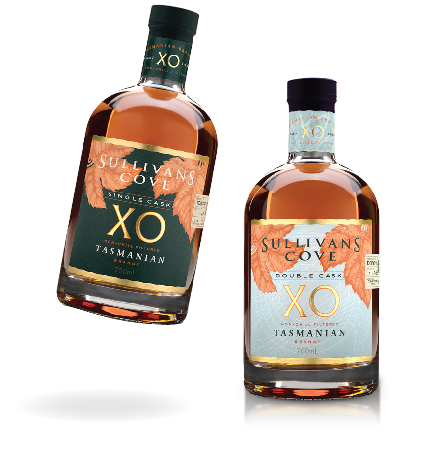
The Sullivans Cove XO labels borrow from the brand’s established label shape and features their exisiting logotype. This is where the similarities end. The XO labels sit naturally alongside the existing products, but are quickly identifiable as an outliers to the Sullivans Cove Whisky range. Imagery, typography and premium print treatments were all developed to entice customers back to this often overlooked category.


2014, PACKAGING DESIGN,
San Francisco International Wine Competition
Double Gold
Maidenii was the first Australian Vermouth to hit the shelves. With limited popularity at the time, it often served as an introduction to the entire category. The labels were designed to sit naturally amongst its European counterparts, each label celebrating just four of its many botanicals. Maidenii is now synonymous with Australian Vermouth and its success has seen many others follow in its footsteps.


2019, AIBA, Packaging
Bronze
Originally briefed as “Holiday Brewing”, this brand had sunshine and beach culture at its heart. Naming conflicts arose mid project, Small Fortunes led the team to “Lost Palms”, maintaining their intended theme of an oasis from day-to-day life. A team with no fear of colour, 301 Days Of Sunshine is one of many of Lost Palm’s vibrant cans that Small Fortunes has designed for this Gold Coast Brand.
